Benötigen Sie Hilfe?
Der Kontakt zu uns

Egal ob erste Beratung oder konkrete Service-Fragen - mit unserem Kontaktformular finden Sie den richtigen Ansprechpartner.
Introduction to Dashboards
Introduces the functions of the Dashboard Designer program.
PVGuard comes with range of pre-defined plant views to cover its users’ needs for power-plant supervision. These are based on skytron's extensive experience of working with energy generation systems. However individual users may prefer the monitored data to be displayed in a particular way or to design their own mimic diagrams, suited to their own arrangement of plants and including their own branding.
The PVGuard dashboard addresses these requirements by giving skytron's users the ability to design their own customised plant displays – known as dashboards. In this way, you as a PVGuard user, can define your own displays that show just the information you need and in exactly the way you want.
All the data channels that you have access to in PVGuard are available to be used in dashboards. In addition, you can include your organisation's own graphics such as branding and symbols, site maps, and pictures, equipment graphics and photos. In this way, by using dashboards, you can maximize the attractiveness and usability of PVGuard.
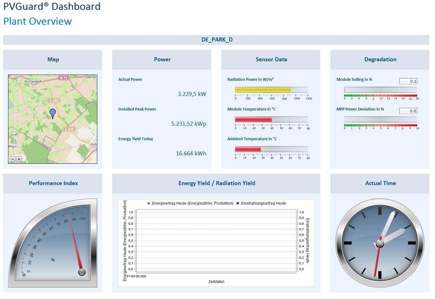
Dashboards are created using a special tool called the Dashboard Designer. This tool provides you with a range of basic elements, called widgets. Using these widgets you can assemble sophisticated and complex dashboard designs.
- Their appearance - shape, colour, borders, text, fonts
- What data is displayed - values, data channel names, status values - and how
- Labels for displaying text and data values
- Bar displays, either horizontal or vertical
- Status “LED” indicators
The Dashboard Designer
Dashboards and the Dashboard Designer are included as standard components of PVGuard. Opening a dashboard will open it in the same way as other Views in PVGuard. It will include all the normal PVGuard features such as an adjustable time-bar and automatic refreshing.
The difference between dashboards and other PVGuard plant status views is that the design of a dashboard is not fixed; you can create, edit and adjust the design of a dashboard as you wish.
The Dashboard Designer allows you to design and edit dashboards. You can open it directly from the PVGuard menu by using the command .
The Dashboard Designer Program Window
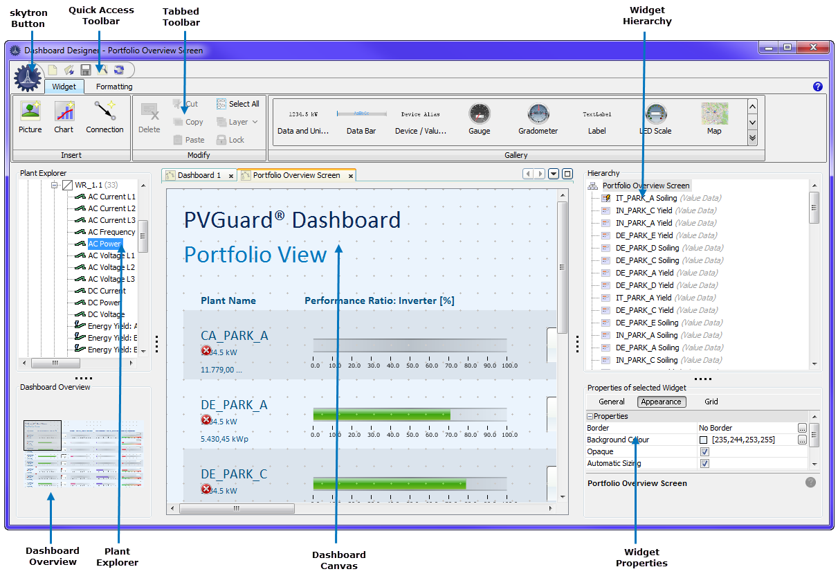
When you open the Dashboard Designer, the program window will appear as shown below.
Regions of the Window
The Dashboard Designer program window is divided into the following areas:
- Quick Access Toolbar and Application Button
- Provides commands to allow you to create a new dashboard, save a dashboard, refresh the window etc.
- Tabbed Toolbar
- The main toolbar allows you to create a widget, an element in a dashboard, and adjust how it is formatted. Clicking on a tab shows the commands that are relevant to the current dashboard , organized into groups. The available commands also depend on the selected widget.
- Plant Explorer
- Similar to the one in PVGuard, the Plant Explorer allows you to select data channels from your portfolio of plants; these can then be dragged and dropped in to a dashboard.
- Dashboard Canvases
- The canvases form the main working area of the tool where the dashboard under development is pictured and worked on. You can have more than one dashboard open at a time if you want; each opens in its own canvas in a separate tab. The background canvas is shown with a dotted grid to help you align the widgets; they will snap to the grid.
- Dashboard Overview
- The display may only be big enough to show a small section of the dashboard you are working on. The Overview provides you with a thumbnail view of the whole dashboard, and shows you where the working window is located within it.
- Hierarchy
- All of the widgets currently being used in the open dashboard are listed here. Selecting a widget here will also select it in the main canvas. The order of widgets here also determines how overlapping widgets will be shown; those at the top of the list are shown on top of those lower down it.
- Widget Properties
- This tabbed panel shows you all the properties of the currently selected widget, and allows you to modify them, so changing the widget's appearance or behaviour.
Getting Going
It's easy to start developing your first dashboard. The following section walks you through the steps.
A First Design
In the Dashboard Designer your power plants are shown in the Plant Explorer pane at the left of the program window. Expand the folder for a plant until you find the device or data channel you want to display. Click on this entry and drag it into the desired position on the canvas, keeping the mouse key pressed while you do this.
When you release the mouse key a dialog will pop up. This will show a choice of the widgets that are available for that type of device or data channel. There may be several choices available. For example, a power output channel could be shown as: a gauge or a bar display, a label showing the output as a value or a label showing the name of the channel.
Choose the form you want from the choice and allow it to drop into place.
Carry on dragging devices or data channels from the Plant Explorer until you have completed your design.
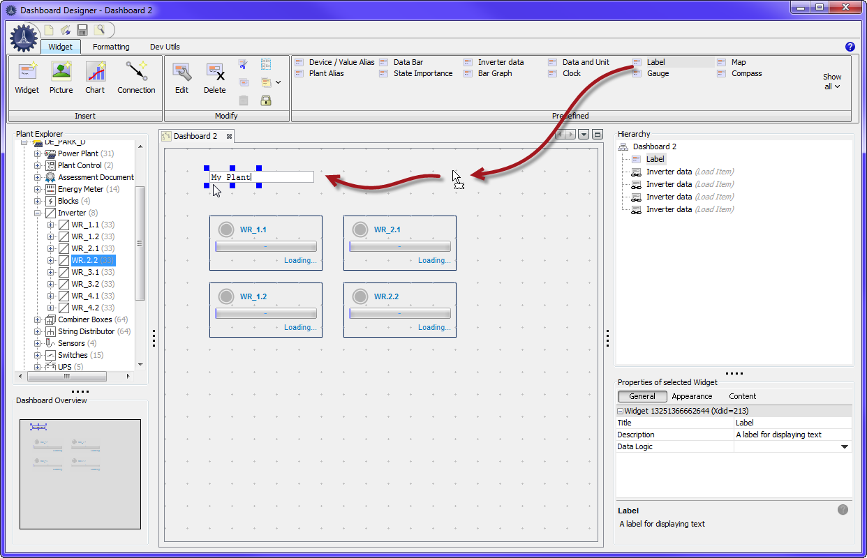
Then, suppose you want to add a title to your dashboard. To do this, pull the widget named Label from the Gallery group of the Tabbed Toolbar at the top of the program window. Pull it to the correct place at the top of the canvas, and let it drop.
If you double click the widget, you will be able to change the text.
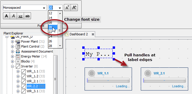
Next, format the label's appearance by selecting it and choosing your desired font size from the Font group of the Formatting tab in the Tabbed Toolbar. Then adjust the size of the widget by pulling its handles, so that the text is visible in its entirety.
While you are laying out your design, you can use the Preview control on the Quick Access Toolbar at the top of the program window to see how the dashboard will finally look with real data loaded. When you are satisfied with your design, save it using the Save control. You can find this by clicking on the Application Button. A dialog will open to let you give the widget a name and description. After this the dashboard will become available in the View Navigator under the dashboards folder for the relevant plant.
That's it!
General Hints
- You can pull any device into your dashboard, from an individual data channel right through to a whole power plant.
- Normally when you pull a device, you will see a small rectangle following the mouse, representing the device being pulled. If you don't see this, then this means there is no data available for that device that can be shown in the available widgets.
- You can also select and drag several devices at once by means of the usual mechanisms in Windows or OSX for selecting several items. When you let them drop, the dialog that pops up will show the widgets available that are common to all the selected devices or data channels.
- Be careful that you correctly select the data channels that show the data you want to display. For more details, see .
- Once you have let the device or data channel drop, you can change the data it shows, or other aspects of the widget, such as its colour, using the widget attributes panel on the lower right of the program window.
- As demonstrated with the label in the example above, you can also create a widget by pulling one of the widgets from the Gallery tab of the Tabbed Toolbar onto the canvas.
Working with Dashboards
This section explains the operations you can perform on a dashboard as a whole: creating, saving, renaming, deleting a dashboard.
Opening a Dashboard in PVGuard
In the View Navigator you will find several folders named Dashboards in the hierarchy. These are present at both the root (uppermost) level and also under individual plant folders. Any dashboard designs you have already published will be listed under these folders.
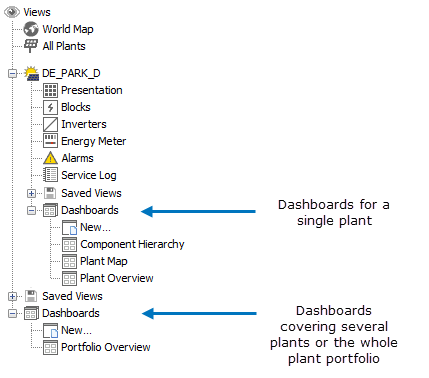
Double click the desired dashboard to open it, and it will be presented as a new View.
Creating a new Dashboard
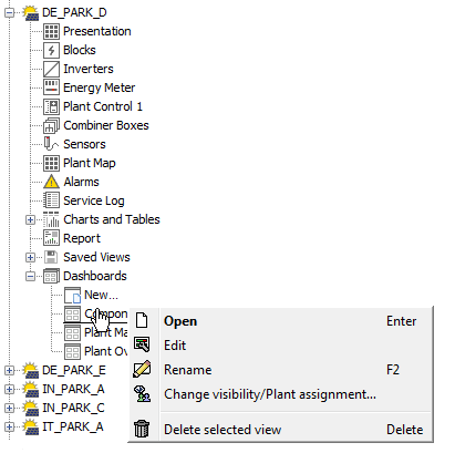
If you want to create a new dashboard, click on the New... entry at the corresponding place in the PVGuard View Navigator.
When showing data from several plants in your dashboard, you should create the dashboard under the Dashboards entry at the topmost level of the View Navigator hierarchy. Otherwise, create it using the command under a specific plant.
Creating a dashboard from Dashboard Designer
If you are already working in Dashboard Designer you can also create a new dashboard directly from within it. Click on the Application Button at the top left of the program and use the New Dashboard command. A new, blank canvas will be opened in the canvases area.
Opening a Dashboard for Editing
Saving and Previewing your Work
Saving your Design
At a certain point you will want to save the work you have done. The commands for this are located in the menu of the Application Button and function as usual: use the Save command to initially save or re-save your design. To save a design under a different name of for a different plant use Save As.
The dashboard will be saved on the skytron servers.
Previewing the Result
- In the Quick Access Toolbar at the top left of the program
window, using the preview button:

- Using the Preview command in the menu under the skytron Application button.
Deleting and Renaming Dashboards
Deleting a dashboard in PVGuard
To delete a dashboard, first locate its entry in the PVGuard View Navigator. Right click over the entry, then in the context menu click Delete selected view.
Renaming a dashboard in PVGuard
When you publish a dashboard, you are asked for a name for the dashboard. This is the name by which it will appear in the PVGuard View Navigator. To change its name later, locate its entry in the PVGuard View Navigator. Then right click over the entry, and click Rename in the context menu.
Changing which plant a dashboard is assigned to
Dashboards will be listed under a particular plant in PVGuard. To change this assignment, locate its entry in the PVGuard View Navigator. Then right click over the entry, and click Change visibility/Plant assignment in the context menu. A dialog will appear where you can change the assignment.
Working with Widgets
Widgets are the basic building blocks of a dashboard. There are lots of different widgets available, and the range will increase with time. Widgets are usually bound to a data channel for one of the devices in a plant. You create your dashboard simply by arranging these widgets on the canvas in the way you want. You can also link them together using connectors too, for example to show the direction of energy flow through the plant.
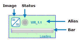
The rest of this chapter explains how you can insert and format a widget in your dashboard.
Inserting a Widget into your Dashboard
There are a number of ways to insert a widget using the Dashboard Designer.
- Possibly the simplest way is to select a device or data channel from the Plant Explorer
and then drag it into the design's canvas.
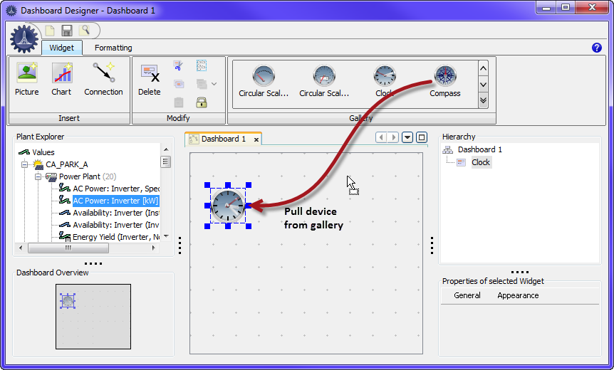
Figure 2. Dragging a widget onto the canvas

When you drop the widget into place, a pop-up dialog will open which allows you to choose what sort of widget is to be used to display the data. The choice will depend on the sort of data channel you have chosen in the Plant Explorer.
- Alternatively, click on one of the widgets in the Gallery tab of the Tabbed Toolbar.
Then, holding the mouse key down, drag the widget into your design. Release the mouse at the chosen place.
Figure 3. Dragging a widget onto the canvas

In this case, after dropping it, you will have to change the properties of the widget manually to those you want. You can do this in the Widget Properties pane of the program window.
- Similar to the above, click on a widget in the Gallery, but release the mouse key before moving the mouse.
The widget will remain "stuck" to the mouse. Move the mouse to the point on the canvas where you want the widget, and
then click again with the mouse. Now you have two options:
- Release the mouse straight away, and the widget will drop into position on the canvas.
- If you drag the mouse over the canvas before releasing the mouse key, the widget will be automatically re-sized to match the size of the mouse drag. This allows you to insert and resize a widget in a single operation.
- Copy and paste an existing widget into the current design from this or another Dashboard. After pasting it you will have to manually change the widget's data channel and other properties in the Widget Properties pane (you can also change the data channel by dragging from the Plant Explorer as described below).
Changing the Data Channel in a Widget
In a similar way to dragging and dropping a data channel from the Plant Explorer to create a new widget, you can also drag a data channel into an existing widget. The widget will then show data for the dragged data channel - as long as it has a compatible type.
Changing the Text in a Widget
- Click the text area once so that the text cursor appears.
- Press <ALT> and <RETURN> on the keyboard.
Adjusting how a Widget looks: Widget Properties
Once you have created a widget for a device or data channel on the canvas, you may find it is not showing exactly the data you want, or showing it in a different way to how you would like. The Widget Properties pane on the lower right-hand side of the Dashboard Designer display allows you to change many aspects about what data a widget displays, how it displays the data and how it appears.
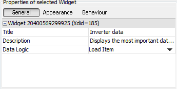
Whenever you select a widget - e.g. by clicking on it in the canvas or in the Hierarchy - then the properties of the widget will be displayed in this pane.
- General
- The core properties, such as name and type of the widget
- Appearance
- Properties that affect how the widget appears, for example, colour, font, text alignment.
- Behaviour
- What data the widget is associated with and how that data is to be presented (for example, with or without units being shown).
- Content
- Where you can define the content of a widget yourself - e.g. the text in a text label, or a background image - this is where you can set this up.
The values that you can enter for a property depend on the type of the property. In some cases the value will be True or False (i.e. On or Off), represented by a tick box; others are more complex. Often there is a helper to allow you to choose the value more easily. This will be shown by a ... button at the end of the field for the value. An example would be a colour picker dialog that pops-up to help you set the foreground or background colour.
Some of the Common Widget Properties
| Tab | Property | Description |
|---|---|---|
| General | ||
| Title | The name given to this widget, as it appears in the widget hierarchy. | |
| Description | What the widget does (read-only). | |
| Layout Constraints | Describes the placement and size of the widget on the canvas (read-only). | |
| Appearance | ||
| Border | What sort of a border appears around the widget. You can set borders of a certain colour and width, choose to have no border, or use an empty (transparent) border. (See also Transparency). | |
| Foreground/Background Color | Lets you set the colour and transparency of any foreground (e.g. text) and background for the widget. The pop-up helper gives you a choice of various colour pickers. | |
| Opaque | Sets whether the widget covers those behind it (ticked), or whether they are visible through it. The default is usually transparent. | |
| Horizontal/Vertical Alignment | The alignment lets you set the position of the widget's content in relation to its defining frame or border. | |
| Font | The Font property allows you to set the usual characteristics for a font such as font face, size, style. | |
| Behaviour | ||
| Data Source Component | Shows the data channel that the widget is bound to. For more details, see Binding Widgets to Plant Data. | |
| Show Unit | Whether the data value is shown with units or not. | |
| Text for Data Gap | A test message you can use if there is no data available for a certain date. | |
| Unit | The units and scaling factor applied to them. For example, temperature might be shown in °C or °F. Energy in kWh, MHh or GWh. | |
| Data Conversion | This property allows you to convert the data into another scaling or unit by entering a formula. See Applying a Conversion Factor. | |
| Custom Component Alias | This property allows you to give the widget a particular name. It will be displayed in the tooltip for the component, and in some cases elsewhere on the component, for example, the fascia of a gauge. |
Binding Widgets to Plant Data
Most widgets will be associated with some component in one of your plants, for example with an inverter, or with a data channel for the whole plant like Energy Yield. This association is known as the Data Binding.
If you insert a widget into your dashboard by pulling it from the Plant Explorer, then the binding to that data channel will be created automatically. However, if you create it by pulling a widget from the Gallery in the Tabbed Toolbar, then you will have to set it up yourself. Alternatively, if you copy and paste a widget, then it will retain the original data binding, and you will have to change this manually to show data from a different data channel or device.
The data binding is set or changed through the Data Source Component property of the Behaviour tab in the widget's properties. Click on the ... button to change this. A dialog will open which allows you to select the data channel to be bound to the widget.
You can also pull a data channel from the Plant Explorer into an existing widget in your design. If the data channel is suitable for the widget, it will overwrite any existing source in the Data Source Component property.

The Widget Hierarchy Pane
If you are designing a large or complex dashboard, it can quickly become dense with widgets and complicated to work on. The Widget Hierarchy pane on the right-hand side of the Dashboard Designer can help you navigate around your design.
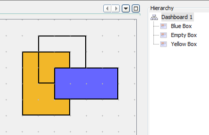
All widgets in your design are presented as a list here. Clicking any widget in the list will also select that widget on the main canvas. The order of the widgets in the list also determines how widgets will appear over others; those at the top of the list will appear above those further down.
Laying it Out
This chapter gives you some tips about the features available when designing a dashboard to help you achieve the effects you want.
The Grid
The Dashboard Designer provides a grid to enable you to easily align widgets horizontally and vertically. The grid is marked by the dots on the background canvas of the dashboard. If you click on one of the handles on the edge of a widget and pull them, these will automatically snap to the nearest grid vertices. If you move a widget by clicking and dragging it, then the position of the whole widget will snap to the nearest grid point at the new location.
Widget Order
- Selecting the widget in the Widget Hierarchy Pane and pulling it up or down in the list. Those at the top appear over those lower down.
- Selecting the widget you want to move and then clicking on the Layer button in the group of the Tabbed Toolbar. You can then use the commands there to move the widget towards the top, or push it down.
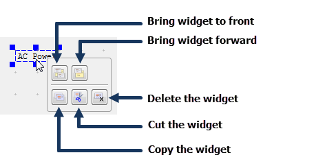
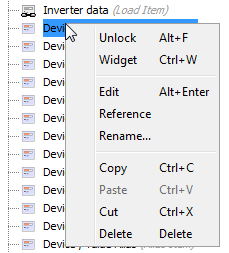
- Right-click the widget. If it is lying behind or in front of other widgets, then commands will be available in the context menu to move it forward or backward.
Transparency
- Set whether the background is transparent or opaque; that is whether you can see the widgets below the top one, or whether it completely blocks them out.
- Set the colour of the background. This will only apply if the widget is opaque.
- Set whether the widget border is visible, and set its the colour and width. Widgets may have 3 border settings:
- Coloured border, where the border has a set colour and width
- No border, where the background colour fills right to the widget's edge
- Empty border, where there is a border area, but it is transparent, letting any widgets below show through
Figure 2. Different types of border. The picture shows a widget with (left) No border (center) Solid Border (right) Empty border.
Getting the Data Right
When creating dashboards it's essential that you ensure that you display the data correctly, and in the way you want. This chapter gives you some tips and advice concerning the choice of data and how to display it correctly.
Choosing the Correct Data Channels
First, you need to ensure you are displaying the correct data channels from PVGuard. In principle this is easy, just pull the data channel from the Plant Explorer into your design. However there are a few things to watch out for.
Channels with Energy Data
Energy channels show the accumulated energy generated by the plant or one of its components since a certain date or time. There are usually a number of these channels available: some may show the accumulated energy since the start of logging; others may just show the energy produced today; these will be reset to zero each night.
When energy channels are displayed in PVGuard usually they are shown with the Delta aggregate applied. This means the chart actually shows the change in energy, giving a typical "bell" shaped curve over a day as shown in Figure 1. However, the widgets available for dashboards do not always include the ability to apply aggregate functions to the data - the value returned is the last raw data value.
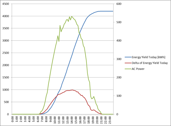
So, for example, if you include plant a data channel for plant energy production and want to show it on a circular gauge display, the value will rise from zero at the start of the day, and steadily rise as the day progresses, finally dropping to zero again at midnight.
If you want to include data similar to the PVGuard display for energy output, then we recommend you use the equivalent Power Output data channel for the widget, which will produce the expected bell-shaped curve.
Note however, that charts included in dashboards do include the ability to show data with the delta aggregate applied.
Irradiation
Similar arguments to energy output channels also apply to the data channels used for irradiation. Most widgets will display the irradiation energy channels as the accumulated energy. If you wish to show data for the changes in the irradiation energy change, we recommend you use the irradiation power channels unless you are using a chart widget.
Performance Ratio
Values for the Performance Ratio show the result of a calculation based over the past minute's data. The data therefore shows a Performance Index, and not a true Performance Ratio, which needs to be calculated over a much longer aggregated time.
Applying a Conversion Factor
- Converting between one sort of unit and another (e.g. kWh to J), where this is not automatically supported.
- Changing the scaling factor on the data units (e.g. kWh to MWh) to a non-standard scaling.
- Calculating a monetary value based on a feed in tariff (e.g. 200 kWh at $x per kWh).
- Select the relevant widget.
- In the Widget Properties panel, find the Data Conversion property (under the Behaviour tab).
Enter the formula for the conversion into this property; it has the form:
y = x * multiplier unit1/unit2 + offset
Here:
- multiplier
- Is a number such as 2 or 3.412.
- unit1
- Are the output units, for example €
- unit2
- Will be the units of the data channel, but at an appropriate scaling e.g. kWh, MWh
- offset
- Is also a number such as 2 or 3.412. This is a fixed constant that will be added to the result (in the output units).
Jazzing it Up: Adding Graphics
To make your dashboards look really attractive they can include your own graphics, pictures or charts. These might include your company's logo, pictures of the plant or site, sketches of the equipment etc.
Graphics in Dashboards
Storage of dashboard Graphics
Graphic images in any of the standard formats can be used in dashboards: '.jpg', '.png' or bitmaps. When you import an image from your PC, it will be uploaded into the skytron Cloud. A tool is available to manage these images in the skytron Cloud.
- Importing the graphic or picture file directly into Dashboard Designer from your PC
- Using an image that has already been imported - either by yourself or as a standard image
- Referencing an image in the internet through its Uniform Resource Locator - URL (e.g. http://www.mysite/picture.jpg)
Ways to Add a Graphic
- Click on the Picture button in the group of the Tabbed Toolbar. This will open the Insert Picture Wizard at the start, which will let you choose the source of the image.
- Drag and drop an image from your computer into the canvas. The image will automatically be uploaded and the Insert Picture Wizard will be started, except that the first step - choosing the source of an image - will be skipped.
The Insert Picture Wizard
A wizard has been provided to assist you inserting an image. Open this by using the button in the Tabbed Toolbar. The wizard first page of the wizard, shown below, will open.
During the wizard you will have the opportunity to adjust the image for use on your dashboard. You can Crop, Scale or Rotate it.
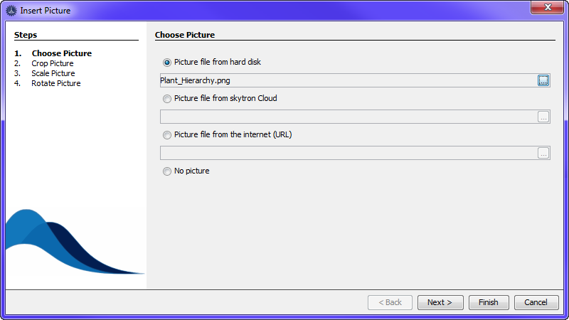
Wizard Page 1: Selecting the source of your image
Choose the source of your widget as described below. In each case, use the Browser control at the right of the option to select:
- Picture File
- The browser will let you choose a file from your PC or network. On clicking Next, the file will then be uploaded into the skytron Cloud repository, meaning that you can easily re-use the same file in this or any other dashboard.
- skytron Cloud
- This opens the Cloud Browser through which you can choose any of the pictures that have already been uploaded into the skytron Cloud - either from Dashboard Designer or from other sources.
- Internet
- Here you can enter a URL for you file in the internet, for example "www.mywebsite.com/images/logo.jpg".
Wizard Page 2: Cropping the image
If you just want to show a small segment of a picture in you dashboard - for example a small section of a site map, you can use the cropping tool. The picture will open with a rectangular window over it.
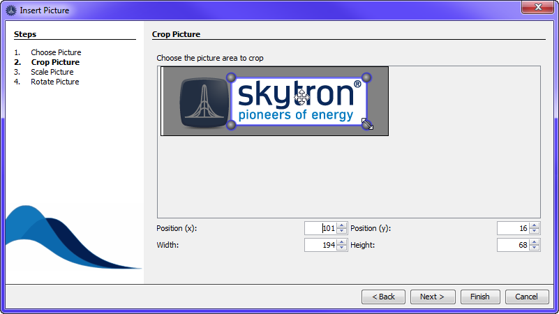
The part of the picture to remain is highlighted, and the part to be cropped out is dimmed. There are spherical handles you can pull at the corners of the selection. Dragging the double arrow symbol will move the whole selection.
Click on one of the spherical handles at the corners of the pictures, and pull it to the corner of the area to be displayed. The part of the picture shown dimmed will be cropped from the final image in the dashboard; only the highlighted section will be shown.
Alternatively, use the controls at the bottom of the dialog to set the exact origin and dimensions of the area you want to display.
Wizard Page 3: Scaling the image
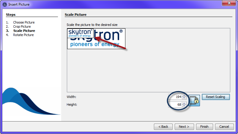
On the third page of the wizard you can enlarge or shrink the image's displayed size. Use the numeric spin-box controls to enter the size of the image as it should appear. By default, the width and height will scale together; click the padlock control to unlock this association if you wish to scale width and height independently. If you make a mistake, the Reset Scaling button will restore the image to its original size.
Wizard Page 4: Rotating the image
Lastly, you can rotate the image if you want. In particular, this allows you to turn an image upside down (180 degree rotation).
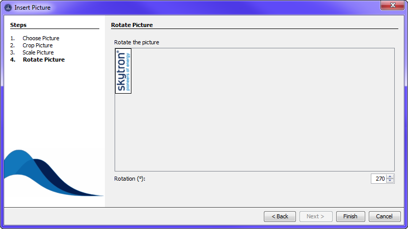
Finally click Finish. If you have chosen to use a picture from a disk from your computer, it will be uploaded at this point onto the skytron Cloud server.
Showing the Trend: Adding Charts
One of the key features of PVGuard is its ability to display dynamic charts of your plant's data. This is available too in Dashboard Designer using the Chart command. By using charts you can leverage the full power of PVGuard on your dashboard.
How to Add a Chart
Using the Insert Chart Wizard
A wizard has been provided to assist you inserting an chart. Open this by using the button in the Tabbed Toolbar. The wizard will open as shown below.
Insert Chart Wizard
Wizard Page 1: Selecting the Data Channels
On the first page of the wizard you can choose which data you wish to show in the chart.
The left-hand pane shows a version of the Plant Explorer.
Select the data channels that you wish to show in your chart.
Either drag the selected channels into the Selected Ids pane on the right-hand side, or press the
![]() button to do this.
The channel will appear in the list on the right.
button to do this.
The channel will appear in the list on the right.
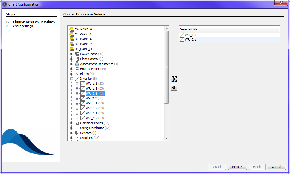
To remove data channel from a chart, select it from the list on the right, then
press the ![]() button.
button.
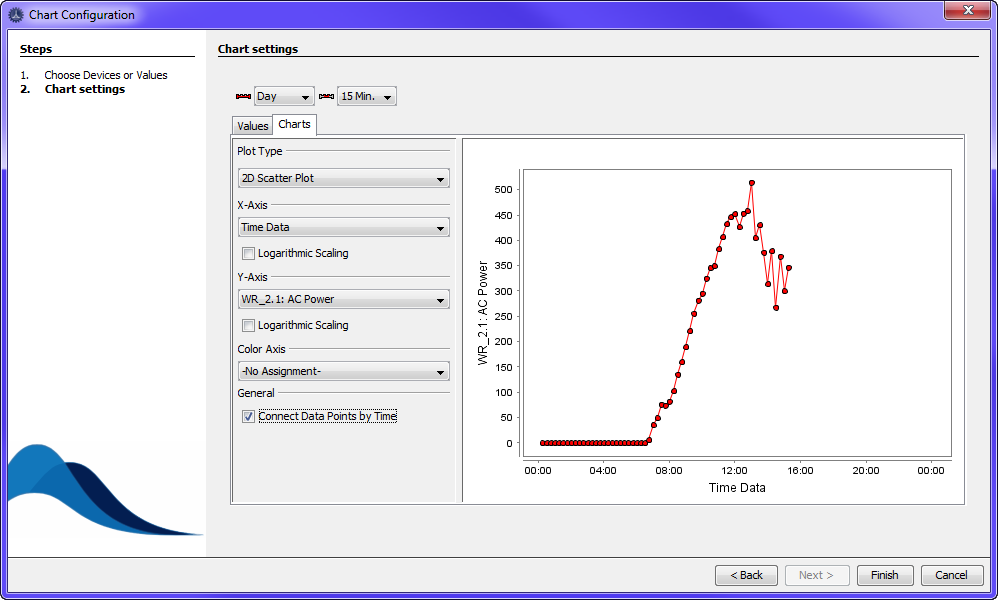
Wizard Page 2: Configuring how the data is shown
- Time Settings at the top.
- Charts in the right-hand tab of the chart display.
- Values in the left-hand tab of the chart display.
Time Settings
Here, you set the period for which the data is to be shown (left-hand selector), and the resolution of the data points on the chart (right-hand selector). The usual combinations of period and resolution that you can use in PVGuard are available, for example year-by-month or day-by-hour.
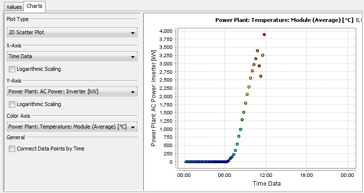
Charts
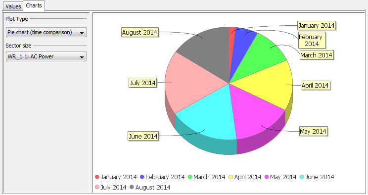
Here, you can set what sort of chart is to be shown and what data is to be shown on which axis. The exact fields available in the remainder of the form will depend on the chart type. They include the following:
- Plot Type
- Typical charts in PVGuard use a 2D Scatter Plot, but you can choose one of a number of other chart types in this field. Some examples are shown in Example Chart Types.
- X-Axis
- The horizontal axis. For a standard plot of historical data, the x-axis should be set to time; however if you want a more sophisticated XY scatter plot, then you can choose a different data channel here. You can also plot the data on a logarithmic scale.
- Y-Axis
- This shows which data is shown on the vertical (Y) axis. In a Multi-Scatter plot you will be able to enter more than one data channel. If you need, you can plot this on a logarithmic scale.
- Color Axis
- This allows you to change the color of the points on the chart according to the value of one of the data channels.
- Sector Size
- On pie charts, this determines which data channel is used to determine the size of the pie sectors (also called slices)
- Connect Points by Time
- If this is checked, the data points on a 2D chart will be joined up. Otherwise just the data points will be shown with no lines.
Values
- Unit
- Here, you can set how the units will be scaled for that data channel, for example, whether power is shown as W, kW or MW.
- Aggregate
- In the same way as in PVGuard, the choice of Aggregate allows you to choose how the value for a point on the diagram is calculated from all the points in the raw data for that time period. For example, the value for a day might be calculated as the minimum, mean or maximum, of 288 5-minute data samples.
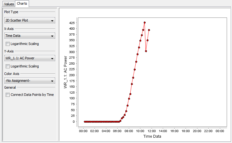
Example Chart Types
The following illustrations give a few examples of the types of chart that can be created.
Joining Everything Together: Using Connectors
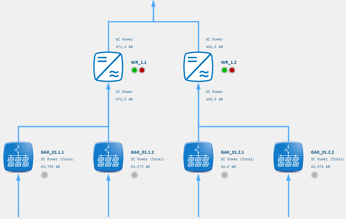
If you are creating mimic diagrams you will usually want to show some sort of flow. This might be the energy flow through the plant - from solar module to grid insertion point. Alternatively you might want to show the flow of the monitoring information from the original equipment to the data loggers. You may want to show a flow in other diagrams too, for example the physical roadways and paths through your sites.
How to Add a Connector
The Connection Tool allows you to connect up the widgets on your dashboard to show such a flow and how the elements of your diagram relate to one another.
Click on the
button in the Tabbed Toolbar. The mouse pointer will change to the connection pointer:
 .
.
Click the mouse on the first (upstream) widget you wish to connect, then pull it to the downstream widget and release it. A connector will follow the mouse as you drag it. After you release the mouse the connection will be finalized between the two widgets. Once you have joined two widgets with a connector, they will stay joined even if you move one or both of them on the canvas.
The Connector Type
Connectors can be drawn in one of two ways:
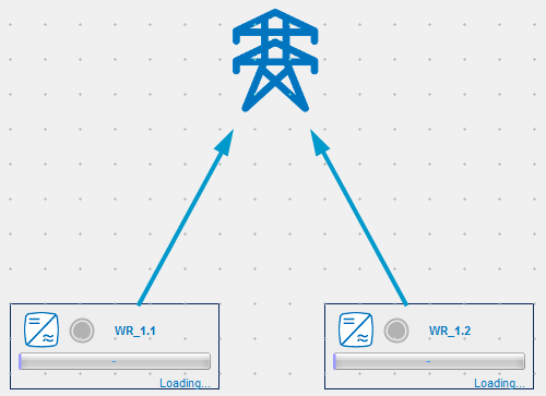
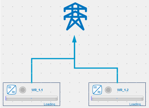
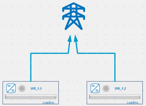
- As a Line connector. This initially connects using a single line using the shortest path between the two widgets. However you can manually adjust the shape of the line by adding additional points, described below.
- As a Right-Angled connector. This will draw the connector using just horizontal and vertical line segments. This may be clearer in some designs and also if a printed output is required. The routing is done dynamically by PVGuard when creating the dashboard as a view, and so will scale automatically.
The pictures below illustrate lines of type: Line, Right-Angled, and manually adjusted.


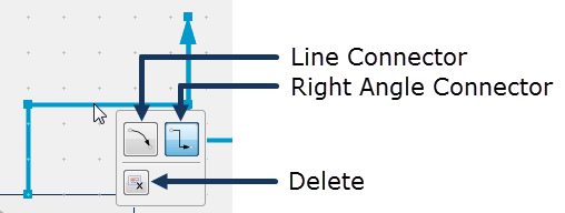
Using the Line Mouseover Tooltip
- Change the connector type to Line
- Change the connector type to Right-Angled
- Delete the connector
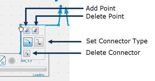
Manual Connectors - Adding Points
- Double click the line at the point where you want to insert the point
- Select the line, then right-click with the mouse and click the Create Point symbol
Once you have created a point, you can click on it and then pull it with the mouse to the desired position. Points will automatically snap to the nearest grid point on the canvas.
To remove a point, right-click on it with the mouse, then click the Remove Point symbol.
Fine Tuning: Connector Properties
Like all other widgets, if you select a connector, then its Properties will become visible in the Widget Properties pane at the bottom right of the program window. They enable you to adjust other features of the connector. Here, you will be mainly interested in those in the Appearance tab.
- Property
- Description
- Line Color
-
Lets you change the color of the line. Clicking the button will open a color-picker dialog. Alternatively you can enter a value, in the form [Red, Green, Blue, Alpha], where Red, Green and Blue are the respective values for the color components (0-255), and Alpha is a value for the transparency (also 0-255; 0 = transparent).
- Line Style
-
Clicking the button will pop-up a dialog in which you can change:
- The connector type
- The line thickness in points
- The dash step - whether the line will be solid (0) or dashed, and what sort of dashes are used
- The arrow width for any arrows at the line start/end (0 = no arrow)
Reference: Toolbars and Canvas Functions
The following section provides a summary of the functions in the program's toolbars and canvas windows.
Tabbed_toolbar
The Insert Group

- Picture
- Opens a wizard that lets you insert and adjust a picture, either from your local PC, from the skytron Cloud, or from the Web.
- Chart
- Lets you set up a chart, on your dashboard, for example, to show Today's Energy Yield.
- Connection
- The connector tool lets you show the order or direction of flow between widgets using arrowed lines.
The Modify Group

- Delete
- Deletes the selected widget (after confirmation).
- Cut, Copy, Paste
- Standard operations using the clipboard.
- Select All
- Selects all widgets on your canvas.
- Layer
- Lets you bring the visibility of a widget towards the front, or move it towards the back. Will determine which widgets can cover others. For more details see
- Lock
Locked widgets cannot be edited any more, or even be selected on the canvas until they have been unlocked. This allows you to protect widgets against accidental changes. Select the widget(s) you wish to lock and press this button.
To unlock a locked widget you must use the Hierarchy pane. For more details see The Widget Hierarchy Pane
The Gallery

Presents the selection of available widgets. On the right hand side are controls to allow scrolling through the widgets, or (bottom button) to open the Gallery in a single pane.
Font Formatting group

These commands allow you to format the text used in widgets. The usual font formatting options are provided: Font name, size, and style. There are also tools to increase and reduce the displayed font size.
The Quick Access Toolbar
The Quick Access Toolbar at the top of the program window provides the following functions:

- Creates a new dashboard.

- Saves your dashboard design.

- Allows you to see a preview of how your dashboard will look.
Working with Multiple Canvases
If you are working on more than one design at once, then the canvas controls at the top right of the canvas area may help you.

- Left Arrow
- Move to previous (left-hand) canvas
- Right Arrow
- Move to next (right-hand) canvas
- Down Arrow
- Presents a list of all open canvases, where you can select one to become the active, working canvas.
- Window
- Expands the current window to fill all of the program window under the tabbed toolbar. After use changes into a restore button.
Laying it Out
This chapter gives you some tips about the features available when designing a dashboard to help you achieve the effects you want.
The Grid
The Dashboard Designer provides a grid to enable you to easily align widgets horizontally and vertically. The grid is marked by the dots on the background canvas of the dashboard. If you click on one of the handles on the edge of a widget and pull them, these will automatically snap to the nearest grid vertices. If you move a widget by clicking and dragging it, then the position of the whole widget will snap to the nearest grid point at the new location.
Widget Order
- Selecting the widget in the Widget Hierarchy Pane and pulling it up or down in the list. Those at the top appear over those lower down.
- Selecting the widget you want to move and then clicking on the Layer button in the group of the Tabbed Toolbar. You can then use the commands there to move the widget towards the top, or push it down.
- Right-click the widget. If it is lying behind or in front of other widgets, then commands will be available in the context menu to move it forward or backward.

Transparency
- Set whether the background is transparent or opaque; that is whether you can see the widgets below the top one, or whether it completely blocks them out.
- Set the colour of the background. This will only apply if the widget is opaque.
- Set whether the widget border is visible, and set its the colour and width. Widgets may have 3 border settings:
- Coloured border, where the border has a set colour and width
- No border, where the background colour fills right to the widget's edge
- Empty border, where there is a border area, but it is transparent, letting any widgets below show through
Figure 2. Different types of border. The picture shows a widget with (left) No border (center) Solid Border (right) Empty border.
